The Title Design Blog
TITLE DESIGN BLOG
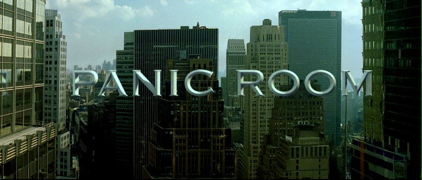
Our titles will be a mix of free-floating and embedded, actors' names and the movie title will be most likely be embedded. With regards to what items, things like personal items, street signs, or store signs are good options. Most of the production-related titles will be free-floating. This seems like a good idea to us since it will emphasize who’s on screen and who handled the background work. Having shots go to black in order to put focus on a text and build tensions in our scenes also seems like something to incorporate. In regards to font, our font needs to fit the story that we have, so something bolder would be best. Something like Gill Sans Ultra Bold, or STHupo. If we decided to go with something less bold then, Perpetua Tilting Mt would be a nice alternative. In regards to color, a black, white, or gray would be good, as a bright color would not fit, and may look garish. Overall, our titles should be with a bold or very serious-looking font and have a neutral color. Hopefully, these aspects will fit the film that we had in mind.


Comments
Post a Comment